2026-06-12
Micro-Graphics AI Prompts for Premium Design Systems
Use micro-graphics, technical marks, serial codes, grids, warning labels, and material details to make AI packaging and posters feel premium.
Try this workflow in Naviya
Apply the prompt structure directly inside Naviya video generation workflows.
Plan a video prompt
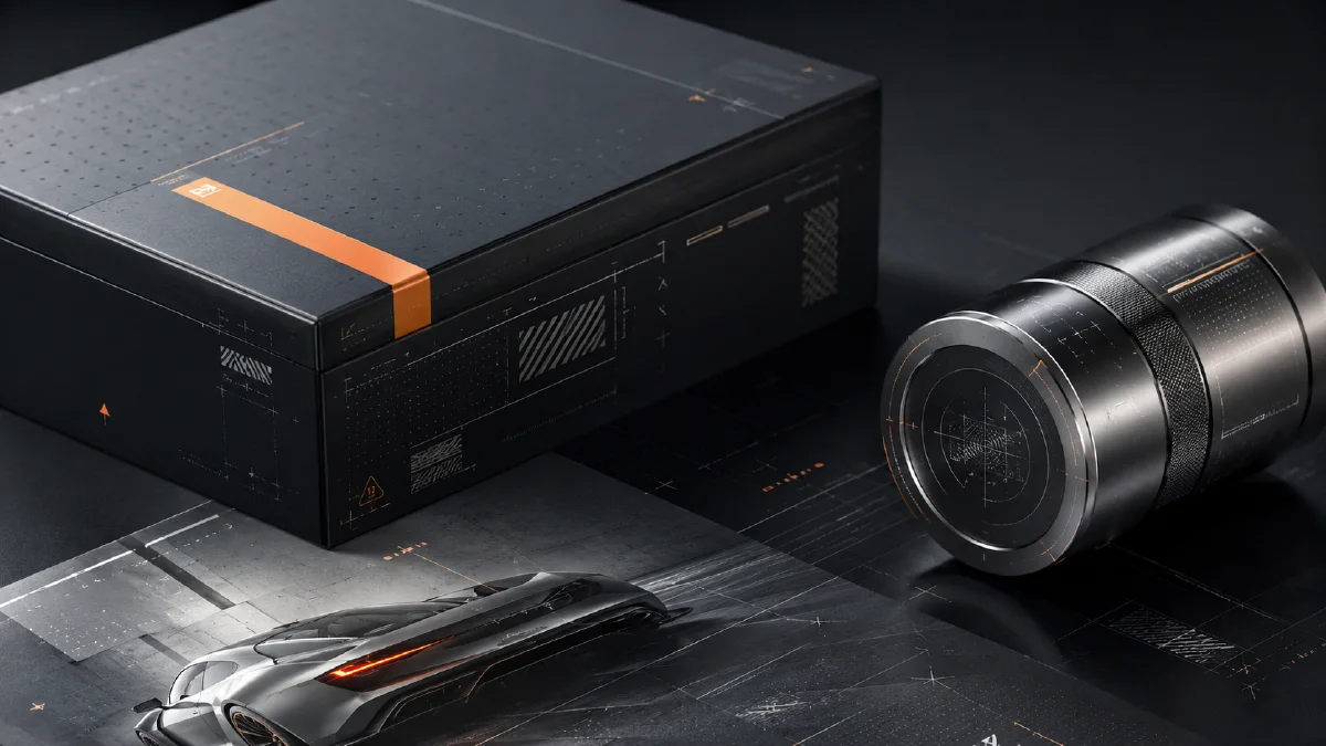
Premium design often uses tiny information that viewers are not meant to fully read. Serial numbers, alignment crosses, crop marks, GPS coordinates, batch codes, warning labels, grid lines, and micro-text create a subconscious signal: this object is engineered, limited, tested, and precise. These details are called micro-graphics.
Micro-graphics are useful in AI packaging, posters, fashion tags, product manuals, tech accessories, coffee bags, skincare boxes, streetwear graphics, and lookbook covers. Use Naviya AI Image Generator to create design stills, AI Video Ads for product campaigns, and Image to Video for macro shots with moving highlights. For related workflows, read AI product scene generation, AI tech product CG images, and AI composition prompts guide.
What are micro-graphics?
Micro-graphics are small visual information systems used as design texture. They may include real product specs, placeholder codes, warnings, measurement marks, grids, molecular diagrams, or tiny blocks of text. Their job is not always readability. Often they create a feeling of precision.
In premium design, micro-graphics can communicate:
- engineered quality;
- limited edition status;
- scientific credibility;
- industrial toughness;
- technical sophistication;
- careful iteration;
- expensive material detail.
The design should still have hierarchy. Micro-graphics support the main subject. They should not overpower the product, package, or poster.
The four micro-graphic families
| Family | Examples | Signal |
|---|---|---|
| Technical marks | crosshairs, alignment grids, crop marks | precision |
| Codes and parameters | SN: 0984-X, VOL.03, REV. B | iteration or rarity |
| Material and warning info | recycling icons, Tyvek marks, voltage warnings | utility and toughness |
| Micro-text | tiny instructions, dense grey text blocks | rigor and density |
These details can make a simple design feel more professional, but only when they are restrained and aligned to the object.
The five-part prompt formula
Use this structure:
[subject medium] + [style definition] + [micro-graphic elements]
+ [color and material] + [rendering and lighting]
In plain language:
What are you making?
What does it feel like?
Which precise technical details are added?
What does the material feel like?
How is it photographed or rendered?
Step 1: choose the subject medium
Be specific about the designed object.
Fashion and retail:
- high-end clothing hang tag;
- streetwear oversized T-shirt graphic;
- fashion lookbook cover;
- sneaker shoebox design.
Tech and industrial:
- smartphone back panel concept;
- industrial mechanical parts packaging;
- electronic product instruction manual;
- camera accessory label system.
Lifestyle:
- premium milk carton packaging;
- specialty coffee foil bag;
- skincare product box;
- supplement label system.
The medium affects everything. A clothing tag needs paper texture and retail typography. A phone back panel needs material precision and reflection.
Step 2: define the style
Choose a design language before adding details.
| Style | Use when |
|---|---|
| Swiss International Style | you need rational grid-based clarity |
| Industrial techwear aesthetic | you need rugged, functional, outdoor energy |
| Dieter Rams-inspired minimalism | you need calm industrial restraint |
| Cyberpunk minimalism | you need future-tech without visual chaos |
| Brutalist typography | you need aggressive hierarchy and contrast |
Do not mix every style in one prompt. Micro-graphics already add density. The overall style should stay coherent.
Step 3: add micro-graphic elements
Use concrete elements:
micro-graphics including crosshair alignment marks, crop marks,
registration marks, dense isometric grid lines, topological contour
lines, random serial numbers such as BATCH-0089, VOL.04, REV. B,
technical parameters, warning labels, barcode placeholders,
QR-code placeholders, molecular structure diagrams, and blocks of
tiny micro-text instructions.
If the image becomes too busy, reduce the list. Premium design often uses more empty space than decoration.
Step 4: specify color and material
Restrained color makes micro-graphics feel more expensive.
Useful palettes:
- pure black and cool grey monochrome;
- void black with neon safety orange accents;
- clinical white with Klein blue typography;
- light grey with muted olive accent;
- off-white with dark charcoal text.
Useful materials:
- frosted polycarbonate;
- brushed aluminum;
- wrinkled Tyvek paper;
- translucent PVC overlay;
- matte uncoated paper;
- silver foil stamping.
Material language matters because micro-graphics look different when printed, stamped, embossed, or placed under transparent plastic.
Step 5: control rendering and light
Use photography or rendering language to make the details feel real.
shot on 100mm macro lens, shallow depth of field, f/1.8,
softbox studio lighting, realistic shadows, photorealistic,
ray-traced reflections, high-density matte coated paper texture.
Macro language is useful when tiny codes should be visible. Softbox lighting works for packaging. Overhead flat lay works for manuals and lookbook spreads.
Prompt examples
Tech skincare box:
Minimalist tech skincare product packaging box design, Swiss typography
style, clean white background. Micro-graphics including tiny ingredient
percentages, molecular structure diagrams, volume parameters
"150ML / 5.0 FL.OZ", and registration marks. Silver foil stamping
details, soft studio lighting, realistic shadows, photorealistic.
Specialty coffee packaging:
Minimalist specialty coffee drip bag outer packaging box laid flat.
Modern organic design, light grey matte uncoated paper texture.
Micro-graphics featuring altitude parameters "ELEV. 2100M",
roast temperature "195C", and tasting notes organized in a strict
Swiss grid using subtle dividers "::". Clean charcoal typography with
a single muted olive green accent, soft natural window light,
elegant photorealistic presentation.
Designer home lookbook:
An open spread from a high-end designer home identity manual.
Architectural visual style, intellectual aesthetic, Swiss typography
layout. Massive white negative space contrasting with multiple columns
of micro-text typography texture, chapter codes "[CHAPTER. 02 // SEC. B]",
golden ratio grid indicators "1:1.618", and minimal vertical dividers.
Clinical off-white background, dark charcoal grey text, high-density
matte coated art paper texture, overhead flat lay shot.
Try it in Naviya
Create one packaging or poster direction in Naviya AI Image Generator, then iterate by changing only the micro-graphic family: technical marks, serial codes, material labels, or micro-text. For campaign motion, use Image to Video to create a macro push-in over the printed details.
How to keep micro-graphics premium
Premium micro-graphics need restraint. Leave more empty space than you think you need, then place the tiny information where a real designer would place production marks: near edges, inside grid columns, beside product specs, around a label panel, or along a fold line. If the marks float randomly in the center of the image, they look decorative instead of technical.
Scale is also important. Mix one or two readable codes with many tiny texture-like lines. This creates hierarchy: the viewer can catch "REV. B" or "ELEV. 2100M" quickly, while the smaller text becomes an atmosphere of precision. For physical packaging, ask for print behavior such as silver foil stamping, embossed ink, matte paper absorption, or translucent overlay. Those material cues make the details feel manufactured rather than pasted on.
Use real specifications only when accuracy matters and you can verify them. For concept art, placeholder codes are acceptable because they function as design texture. For live product packaging, replace placeholders with approved volume, material, compliance, and ingredient information before production. AI can create the visual system, but the final commercial file still needs human review for claims and labeling accuracy.
Premium design checklist
- The main object is still the hero.
- Micro-graphics align to a grid.
- Codes look intentional, not random noise.
- Color palette is restrained.
- Material feels physical.
- Empty space is preserved.
- Tiny text acts as texture without pretending to be important body copy.
Micro-graphics work because they make the design feel built. Use them as signals of precision, not as clutter.