2026-06-12
Wes Anderson Style AI Prompts: Symmetry, Pastels, and Set Design
Write Wes Anderson style AI prompts with centered symmetry, pastel palettes, vintage set design, restrained expressions, and cinematic composition.
Try this workflow in Naviya
Use the guide to shape a still image, then keep it as a first frame or campaign asset.
Open the studio
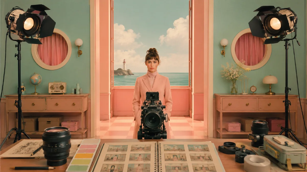
Wes Anderson style AI prompts are popular because the visual language is instantly recognizable: centered symmetry, pastel color, flat frontal staging, vintage props, composed characters, and a world that looks carefully arranged before the camera arrives. But the same familiarity can become a trap. If the prompt only says "Wes Anderson style," the output may turn into a generic pastel room with a centered person.
The better approach is to write the style as a production design system. What is the scene? What colors are repeated across walls, wardrobe, and props? Where is the camera? What does the character refuse to express? Which objects make the frame feel like a tiny story world?
Use this guide with AI composition prompts, AI color grading prompts, and AI style extraction prompts for stills and subtle motion.
Symmetry is the skeleton
The first rule is composition. A Wes Anderson-inspired image usually feels staged because the frame is built on clear geometry. The camera is often frontal, the horizon is stable, and the subject sits on a central axis. Horizontal shelves, wall panels, train windows, hotel counters, elevator doors, or pool tiles help create order.
Prompt for the geometry directly:
Centered symmetrical composition, frontal camera, one-point perspective, the subject stands exactly on the central axis, horizontal wall lines and doorway edges align cleanly, no tilted camera.
Do not assume the model understands the symmetry you want. If the output drifts, add objects that physically enforce alignment: twin lamps, paired chairs, matching windows, a central desk, or a hallway with repeating doors.
Symmetry should also support the story. A character standing alone in a perfectly arranged hotel lobby feels different from two siblings sitting on matching beds. The geometry can suggest control, loneliness, ceremony, awkwardness, or quiet humor.
Build a controlled pastel palette
Pastel color is not the same as low saturation everywhere. The style often uses deliberate combinations: pink and mint, mustard and powder blue, peach and teal, soft yellow and lavender. These colors appear across set design, costume, signage, and props so the whole world feels coordinated.
Use a palette block:
Palette: dusty pastel pink walls, mint green furniture, cream trim, small cherry-red prop accents, warm natural light, matte surfaces, no glossy neon, no harsh black.
Palette placement matters. If you only list colors, the model may scatter them randomly. Tell it where each color belongs. Walls can be pink, uniforms can be mint, trim can be cream, and one object can be red. This creates hierarchy.
For deeper palette control, build a small palette and reuse it across every prompt.
Make the set do narrative work
The scene should feel dressed, not decorated. A bakery, train compartment, library, elevator, swimming pool, pharmacy, hotel desk, or scout cabin becomes stronger when every prop tells the viewer where they are.
Instead of:
Vintage room, pastel colors, symmetrical, cinematic.
Write:
Frontal symmetrical view of a tiny pastel bakery at closing time, glass display case centered, rows of identical cream cakes, mint green wall tiles, pink paper boxes stacked evenly on both sides, a quiet baker in a cream uniform staring calmly at the camera, soft natural window light, subtle film grain.
The props are doing the work. The baker does not need dramatic emotion because the staging creates the mood.
Use details such as patterned wallpaper, retro uniforms, painted signs, luggage tags, old keys, wall clocks, library cards, brass elevator buttons, pool towels, cake boxes, and enamel badges. Keep them arranged. Messy clutter fights the style.
Character direction: restrained, not blank
Faces in this style often feel calm, formal, slightly awkward, or deadpan. That does not mean lifeless. It means the emotion is compressed into posture, costume, and setting.
Prompt for restraint:
The character faces the camera directly with a restrained neutral expression, upright posture, hands placed carefully at the sides, costume color coordinated with the set.
If you want more story, add one small contradiction: a hotel clerk holding a bouquet of wilted flowers, a swimmer wearing goggles in an empty lobby, a child with a suitcase standing inside an elevator. The expression can stay controlled while the situation creates intrigue.
Avoid exaggerated smiles, action poses, glamour lighting, and messy hair unless the whole image is designed around that contrast.
Texture and camera language
Film grain, matte surfaces, soft natural light, gentle halation, and 35mm or 4:3 framing can help. But do not overload film terms. The look depends more on set, color, and symmetry than on grain.
Useful phrases:
- "4:3 frame, frontal medium-wide shot"
- "soft natural window light with low contrast"
- "matte painted surfaces, no glossy plastic"
- "subtle 35mm film grain"
- "carefully arranged miniature-like production design"
For video, the camera should move carefully. A locked-off shot, slow push-in, gentle lateral slide, or character stepping into the central axis works better than handheld chaos.
Prompt structures
Use this compact structure:
Scene type, centered symmetrical composition, frontal camera, pastel palette with placement, vintage set details, restrained character posture, matte film texture, soft natural light.
Example:
Frontal 4:3 image of a tiny train compartment, centered symmetrical composition, powder blue walls and peach seats, matching brass lamps on both sides, a traveler in a mustard coat sitting upright on the central axis, old luggage tags, patterned curtains, restrained expression, soft natural light, subtle film grain, vintage cinematic set design.
For a product:
A perfume bottle centered on a pastel hotel reception counter, symmetrical background shelves with brass keys, mint green walls, pink receipt slips, cream label, soft window light, matte vintage set design, precise frontal composition.
Common mistakes
The first mistake is using the style label without design details. Name the set, palette, camera, props, and expression.
The second mistake is forcing too much whimsy. The style can be playful, but it is also orderly. Too many cute objects make the frame feel like a mood board instead of a film still.
The third mistake is breaking the geometry with a dynamic camera. If you need action, let the action happen inside a stable frame.
The fourth mistake is using random pastels. Choose two or three colors and assign them to surfaces.
Try it in Naviya
Start in Naviya AI Image Generator with a clear location and palette. Generate stills until the composition is genuinely centered and the set feels arranged. Then use Naviya Image to Video for subtle movement: a character blinking, a slow push-in, an elevator door opening, curtains moving, or a prop being placed on the counter.
If your goal is a series, keep the same palette and camera rules while changing scenes. A bakery, train car, pool, and library can all feel connected when the symmetry, color logic, and restrained performance stay consistent.
Plan a series, not one postcard
This style becomes more useful when it can repeat across a small world. Before generating ten unrelated images, define the rules of the world: the dominant palette, the frame ratio, the level of symmetry, the prop families, and the emotional tone. Then change only the setting or subject from image to image.
A product campaign might use a hotel desk, train compartment, pool towel station, and tiny bakery counter. A character series might keep the same wardrobe color and expression while changing the location. A social set might use one central object in four carefully arranged rooms. The continuity should come from design decisions, not from repeating the same prompt label.
For motion, keep the camera formal. Let a door open, a character blink, a bellhop place a suitcase, or curtains move. Small action inside a controlled frame feels more believable than a dramatic camera move that breaks the composition.
This style is not just pastel decoration. It is production design, geometry, and emotional restraint working together.