2026-06-12
Paper Cutout Clip Art AI Prompts: Build Warm Layered Illustrations
Write paper cutout clip art AI prompts with cardstock texture, rough edges, layered shapes, simple shadows, and playful editorial composition.
Try this workflow in Naviya
Use the guide to shape a still image, then keep it as a first frame or campaign asset.
Open the studio
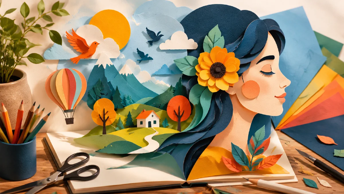
Paper cutout clip art AI prompts are strongest when they feel physically assembled. The style should suggest colored paper, scissors, glue, rough edges, flat shapes, simple shadows, and a little handmade imperfection. It is not a flat vector icon, and it is not a fully rendered 3D illustration. It sits between collage, children's craft, editorial illustration, and warm retro design.
This style is useful for blog headers, explainers, brand mascots, social graphics, product feature art, educational visuals, and playful motion-first assets. It can make technical topics feel approachable because the material language is familiar: paper, card, ink, and touch.
Use this guide with AI style extraction prompts, AI composition prompts, and AI color grading prompts.
Think in layers, not outlines
Paper cutout work is built from stacked shapes. A tree is not a line drawing of a tree. It is a trunk shape, leaf shapes, highlight shapes, shadow shapes, and maybe a background shape. A character is not a fully modeled figure. It is a head shape, hair shape, clothing blocks, eyes, hands, and small details cut from different papers.
Use a prompt structure like:
Subject + separate paper layers + edge quality + shadow behavior + color palette + background surface + composition.
Example:
A cheerful robot gardening in a tiny balcony, paper cutout clip art style, separate cardstock layers for arms, pots, leaves, and tools, slightly rough scissor edges, tiny offset shadows between layers, bright but limited color palette, warm off-white paper background, playful editorial composition.
This tells the model how the image is constructed.
Rough edges create warmth
The appeal of paper cutout is not perfection. Slightly uneven edges, subtle paper fibers, tiny misalignments, and imperfect shape overlaps make the work feel human. But the imperfections need to be controlled. If the prompt asks for too much roughness, the image can look torn or dirty.
Use phrases like:
- "slightly rough scissor-cut edges"
- "visible cardstock fibers"
- "small handmade alignment imperfections"
- "clean shapes with gentle paper texture"
- "soft offset shadows under each layer"
Avoid "messy," "damaged," or "grunge" unless that is the goal. Warm handmade does not mean chaotic.
Use simple shadows
Shadows are what separate paper cutout from flat clip art. The shadow should look like one piece of paper sitting above another. It should not become dramatic studio lighting.
Good shadow language:
small soft drop shadows between paper layers, as if each cut piece is raised slightly from the background.
subtle side light revealing layered cardstock depth, no glossy 3D rendering.
The shadow should clarify the layers, not make the object look like plastic. Add "matte paper" and "no bevelled 3D effect" if outputs become too slick.
Limit the palette
Paper cutout visuals often look better with a limited palette because each color reads like a separate sheet of paper. Choose four to seven colors rather than a full rainbow. Warm primaries, muted retro colors, or bright classroom colors all work.
Palette examples:
tomato red, sky blue, butter yellow, leaf green, cream paper, charcoal detail.
soft peach, navy, mint, coral, warm white, dusty lavender.
bold 1980s classroom palette, red, cyan, yellow, green, black line details.
Assign colors to shapes: blue background, red jacket, yellow sun, green plants. Placement makes the composition feel designed instead of randomly colored.
Keep details iconic
Paper cutout style works best with simplified forms. Tiny photorealistic detail fights the material. If you need a city, use blocky buildings, simple windows, and a few signs. If you need a person, use clear hair, clothing, expression, and pose without rendering pores or fabric threads.
Prompt for "iconic simplified shapes" or "editorial clip art clarity." For complex topics, represent the idea with a scene rather than a diagram full of tiny labels.
Examples:
Paper cutout illustration of an AI image generator as a friendly desk machine, colorful paper sheets entering one side and a small landscape picture emerging from the other, simple shapes, warm educational tone.
Layered cardstock illustration of a creator planning a video storyboard, paper laptop, sticky notes, camera icon, small arrows made from cut paper, clean editorial composition.
Reference boards and consistency
If you are building a series, collect references that share paper thickness, edge quality, shadow depth, and palette. Then extract the common style rules rather than copying any single scene. Paper cutout style depends on constraints: matte material, simple shape language, visible layers, and restrained shadow.
For a brand system, define:
- paper texture level
- edge roughness
- shadow strength
- palette
- character proportions
- background color
- maximum detail level
Reusing those rules across prompts will make separate illustrations feel like one family.
Motion for paper cutout
Paper cutout animation should feel like layers moving on a tabletop. Avoid liquid transformations or realistic physics. Better motions include pieces sliding, rotating, popping up, waving slightly, or separating into layers.
Video prompt:
The paper cutout robot lifts one arm in a simple stop-motion gesture, leaves wiggle slightly, individual cardstock layers cast small moving shadows, camera remains fixed overhead, handmade paper texture preserved.
Another:
The cut paper sun slowly rises behind layered paper hills, clouds slide gently from left to right, low frame-rate stop-motion feel, no 3D plastic rendering.
This approach is ideal for image-to-video because the still frame already contains the layer logic.
Common mistakes
The first mistake is confusing paper cutout with vector flat design. Add paper texture, rough edges, and layer shadows.
The second mistake is asking for too much detail. Small complex shapes can turn into clutter. Simplify.
The third mistake is adding glossy lighting, bevels, and 3D render language. Keep it matte.
The fourth mistake is using full photographic backgrounds. Use paper surfaces, flat color fields, or simple collage environments.
Where paper cutout works best
Paper cutout style is strong for explainers, educational posts, friendly product pages, children's content, nonprofit campaigns, and creator tool visuals. It makes abstract ideas feel approachable because the materials look handmade. It is less effective for luxury products that need glossy precision or for technical diagrams that require tiny labels.
For a useful content set, create:
- one hero illustration with the main idea
- three small spot illustrations for feature cards
- one vertical social frame
- one simple animated loop
Keep the same edge roughness, shadow depth, and palette across the set. A paper system falls apart when one image looks like thick cardboard, another looks like flat vector art, and another looks like glossy 3D. Consistency matters more than detail.
When adapting the style for business visuals, use metaphors carefully. A paper laptop, camera, product box, or tiny storefront can communicate the idea quickly. A crowded paper diagram with arrows everywhere will feel busy and lose the charm.
Try it in Naviya
Start in Naviya AI Image Generator with one clear subject and a small palette. Ask for separate cardstock layers, visible edges, and tiny shadows. Once the still is readable, move to Naviya Image to Video and animate the pieces like stop-motion paper, not like a realistic object.
Prompt block:
Subject, layered cardstock construction, rough edge quality, matte paper texture, small offset shadows, limited palette with placement, simple iconic composition, avoid glossy 3D and excessive detail.
Paper cutout clip art is charming because it makes the visual idea feel assembled by hand. The more clearly you describe the layers, the warmer and more intentional the result becomes.