2026-06-12
AI Banner Design Workflow for Powerful Visual Concepts
Translate abstract banner requests like power, scale, energy, or trust into concrete AI prompt elements, reference analysis, and final ad layouts.
Try this workflow in Naviya
Use references when identity, product shape, outfit, or style needs to stay consistent.
Try reference to video
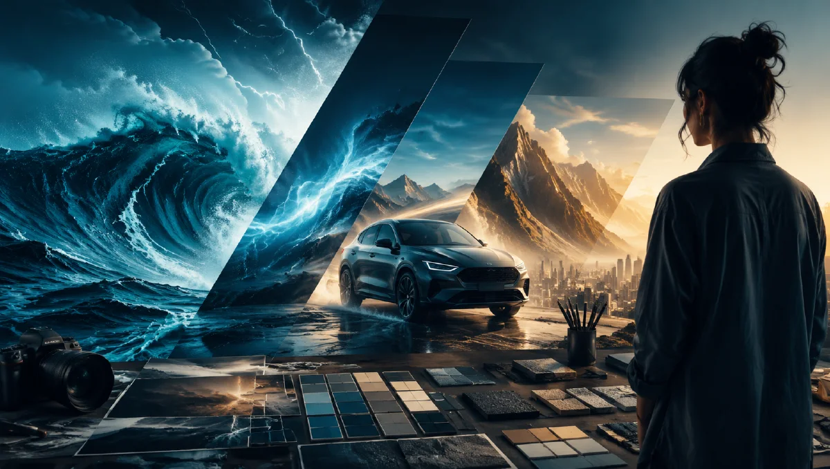
Clients often describe banner direction with abstract words: powerful, premium, energetic, trustworthy, futuristic, natural, stable. These words are useful as intent, but they are not enough for image generation. AI needs visual ingredients: mountains, sunrise edges, deep shadows, wide lens, low angle, textured rock, clean negative space, or a specific color contrast. The designer's job is to translate emotion into visible elements.
This guide shows how to turn a phrase like "make it feel powerful" into a practical AI banner workflow. Use it for website heroes, recruitment banners, energy concepts, B2B campaigns, launch visuals, and social headers. For related structure, read AI visual brief to prompt, AI composition prompts guide, Naviya's AI Image Generator, and AI Video Ads when a banner needs motion.
Translate abstract requests into visual cues
Start by decomposing the word:
| Abstract request | Visual cue |
|---|---|
| Powerful | Mountain scale, sunrise light, low angle, hard edge contrast, deep space. |
| Reliable | Symmetry, stable horizon, clean grid, balanced light, grounded objects. |
| Premium | Negative space, restrained palette, refined material texture, precise lighting. |
| Innovative | Directional light, futuristic architecture, depth lines, subtle glow. |
| Human | Warm light, real gestures, approachable expressions, natural environment. |
For a "power" banner, a mountain scene may work because it combines scale, nature, endurance, and light. But "mountain" alone is still too broad. A better visual idea is "sunlight hitting a high mountain ridge at dawn, warm gold edge light against cold blue shadow, low cloud layers, wide cinematic banner crop."
Use references to control composition
References are not just style inspiration. They teach composition. If a client likes a river aerial, a mountain ridge, or a recruitment banner, analyze it before generating:
- What is the main subject?
- Where does the subject sit in the frame?
- What creates depth?
- What color contrast carries the emotion?
- Where will text go?
- What should stay simple?
Use this analysis prompt:
Analyze the uploaded reference image for an AI banner prompt.
Describe it through subject and detail, environment and scene, style, composition, camera, color, and rendering clarity.
The new banner should follow the same composition, but use a fresh concept.
Keep the final prompt concise and suitable for image generation.
The phrase "same composition, fresh concept" helps when you want the structure of the reference without copying its exact content.
Banner prompt template
Use this six-part structure:
Wide website banner image for [campaign or industry].
Subject/detail: [main visual symbol and key details].
Environment/scene: [location, atmosphere, depth].
Style: [cinematic, realistic, premium corporate, editorial].
Composition: [wide 16:9 or 21:9, subject placement, negative space for text].
Camera/color: [low angle, aerial, telephoto, warm sunrise, cool shadows].
Rendering: realistic high-resolution image, sharp main subject, clean gradients, no text, no logos.
Example for a power concept:
Wide website hero banner for an energy and infrastructure concept.
Massive mountain ridge at sunrise, golden light hitting the sharp rock edges, layered clouds below, deep blue shadow in the valley.
Cinematic realistic style, vast scale and quiet strength.
21:9 composition with the mountain peak on the right third and clean atmospheric space on the left for headline text.
Low aerial camera, warm gold against cold blue, high-resolution realistic landscape, crisp rock texture, no text, no logo.
If the output feels too busy, remove adjectives. Keep the core: mountain ridge, sunrise edge light, cloud layers, negative space, banner crop.
Creating a series from one concept
Many campaigns need more than one banner. Use "change the skeleton, keep the skin" thinking: keep the brand tone and layout system, but change the subject.
| Banner | Shared style | Changed subject |
|---|---|---|
| Power | Cinematic sunrise, wide crop, warm/cool contrast | Mountain ridge |
| Growth | Same crop and light logic | River and green landscape from aerial view |
| Talent | Same negative space and premium realism | Confident professionals in a bright architectural setting |
For recruitment banners, split complex layouts. Generate a clean background first, then a people-focused image, then composite them in a design tool if needed. AI often struggles when asked to create a full recruitment banner with perfect people, architecture, text space, and symbolic elements all at once.
Make banners text-ready
AI image models are not reliable for final typography. Ask for "no text" and leave space for your design tool. A banner should include intentional negative space:
- Left third empty for headline and CTA.
- Top area quiet for navigation overlay.
- Center clear if the page uses centered copy.
- Mobile crop zone protected around the subject.
Before approving a banner, place temporary headline text over it. If the image works only without text, it is not a practical banner yet.
Common fixes
| Problem | Fix |
|---|---|
| Too much detail behind copy | Ask for clean atmospheric gradient or soft cloud space. |
| Visual lacks power | Add lower camera angle, stronger light contrast, larger scale cues. |
| Looks generic | Add specific texture: granite ridge, mist layers, metal railing, river silt. |
| Feels copied from reference | Change subject, color, and environment while keeping composition. |
| Poor mobile crop | Generate a vertical or square variant, not just a wide crop. |
Add motion to a banner
Motion should support the page, not distract from it. For a mountain banner, animate cloud drift and sunlight. For a river banner, add slow aerial movement. For recruitment, use a gentle camera push and subtle natural gestures.
Subtle animated website banner from the uploaded image.
Slow cinematic push-in, clouds drift gently, sunrise light glows on the mountain ridge.
Keep the left side clean for headline text, realistic motion, no text, no logo.
For video-ad adaptation, use AI Video Generator or create ad variations in AI Video Ads. For camera terms, see AI video camera movement prompts.
Banner review criteria
Review banners by placement, not only by beauty. A hero banner, social header, and launch poster have different risks.
Use this checklist:
- The core idea is visible in two seconds.
- The image has a clean copy zone.
- The subject does not compete with the headline area.
- The crop still works on mobile.
- The visual metaphor matches the offer.
- The image can accept logo, CTA, and legal text outside generation.
For a "power" concept, avoid vague force signals like random lightning, smoke, or huge explosions unless the brand can own that mood. Better cues are scale, upward camera angle, strong material contrast, confident posture, compressed space, or a clear before-and-after visual. For a trust concept, use stability, symmetry, calm light, and material clarity instead of noise.
If a banner will become motion, first verify the still as a layout. Then animate only the layer that supports the message: a light sweep across a product, a slow camera push toward a hero object, or a controlled environmental movement. The image to video workflow guide is useful for keeping layout discipline when adding motion.
When in doubt, approve the banner that leaves the clearest copy area.
Try it in Naviya
Turn one abstract brand word into three concrete visuals, then generate them in Naviya's AI Image Generator. Pick the banner that leaves the cleanest copy area, test a mobile crop, and animate a subtle version with Image to Video when the campaign needs movement.