2026-06-12
AI Color Grading Prompts: Use Palette, Contrast, and Color Temperature
Write AI color grading prompts that use palette, contrast, color temperature, saturation, and practical grading notes instead of vague style labels.
Try this workflow in Naviya
Use the guide to shape a still image, then keep it as a first frame or campaign asset.
Open the studio
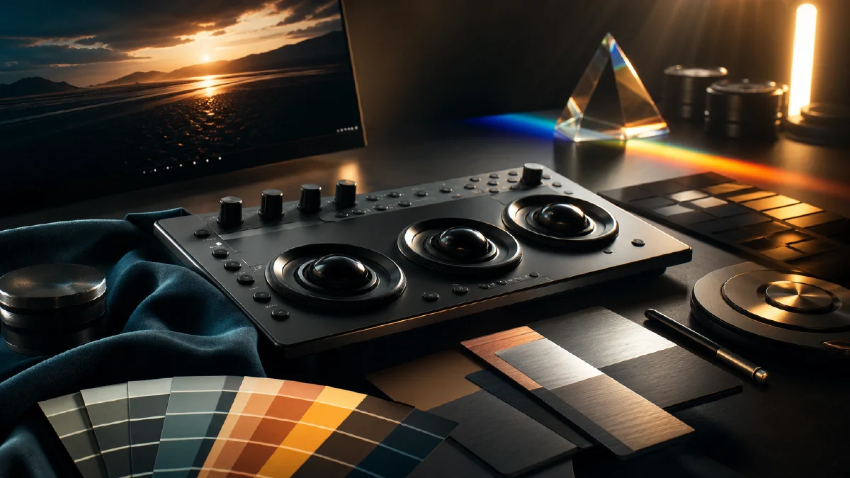
AI color grading prompts work best when they describe color as a system, not as a mood word. "Cinematic," "moody," "retro," and "premium" can point the model in a direction, but they do not define the palette, the contrast, or the temperature of the light.
Color is one of the strongest signals the viewer uses to decide whether an AI image or video feels intentional. It shapes realism, genre, emotion, and continuity. If the color system is vague, the model often reaches for a generic teal-orange filter, oversaturated highlights, glossy skin, or random neon accents.
Use this guide with AI video prompts, AI lighting prompts, image to video workflows, and still frames made for Naviya Video.
The color grading formula
Use this structure:
Palette + luminance contrast + color temperature + saturation behavior + protected colors.
Example:
Desaturated warm sand palette, dominant colors are dusty beige and muted brown, deep charcoal shadows with a slight teal bias, creamy soft highlights, high luminance contrast, no saturated red, no clean blue sky, no glossy HDR look.
This is stronger than:
Cinematic desert scene, dramatic colors, movie style.
The second prompt asks the model to guess. The first prompt gives it a color map.
Replace style labels with color facts
Style labels are useful for quick exploration, but they are unstable when you need repeatable results. A label such as "Wong Kar-wai style" or "Dune style" contains thousands of possible associations: lenses, costumes, lighting, architecture, grain, era, and color. The model may average those associations into something attractive but generic.
Instead, translate the style into visible color facts:
- Hue distribution: which color families dominate.
- Luminance ratio: how bright the highlights are compared with shadows.
- Temperature bias: whether the scene leans warm, cool, or mixed.
- Saturation map: which areas are muted and which accents remain vivid.
- Material behavior: whether highlights feel matte, creamy, metallic, wet, or glossy.
For example, do not only write "retro nightlife." Write:
Deep emerald shadows, warm amber practical lights, muted skin tones, wet pavement reflecting magenta neon, strong contrast, restrained saturation except for small neon accents.
The model now knows which colors belong where.
Build a palette from a reference
When you have a reference image, analyze it before prompting. You do not need a professional color science workflow. The goal is to extract practical anchors.
Look for:
- The two or three dominant colors.
- The brightest highlight color.
- The darkest shadow color.
- Any accent color that should remain rare.
- Any color that should be avoided.
Then write those anchors into the prompt. Hex colors can be useful when you need a very specific palette:
Dominant palette: warm stone beige #cbbfa2, muted tobacco brown #5b4634, compressed charcoal shadow #1b1b1b, faint teal in deepest shadows #163838. Keep saturation low across the full image.
Do not overload every object with hex values. Use hard numbers as anchors, then let natural language explain the visual feeling.
Control luminance before color
Many color problems are actually brightness problems. If the scene is too evenly lit, the palette feels flat. If the highlights are too bright, the image looks synthetic. If the shadows have no detail, the scene becomes muddy.
Useful luminance phrases:
- "high contrast between bright rim light and deep background shadow"
- "soft roll-off in highlights, no blown-out white"
- "compressed dark shadows with faint detail"
- "medium contrast commercial grade"
- "low contrast pastel grade with lifted shadows"
- "16:1 dramatic backlight ratio, subject mostly in silhouette"
For video, keep the luminance system stable from frame to frame. A character can move through light, but the grading should not suddenly jump from warm pastel to high contrast neon unless the scene actually changes.
Use color temperature as story logic
Color temperature is not just "make it blue" or "make it orange." It explains the source and emotional direction of the light.
Warm light often reads as sunlight, lamps, fire, skin warmth, nostalgia, or safety. Cool light often reads as moonlight, shade, screens, distance, rain, night, or tension. Mixed temperature creates depth because different light sources have different jobs.
Example:
Warm amber desk lamp lights the subject's hands and face, cool blue window light fills the background shadow, the two temperatures stay separate and do not blend into purple.
This works well for creator portraits, product shots, and first frames for image to video. It gives the model a reason for the color contrast.
Add saturation rules
AI models often push saturation because it makes outputs look immediately impressive. For cinematic or realistic work, saturation usually needs hierarchy.
Try phrases like:
- "overall low saturation, with only the red indicator light kept vivid"
- "muted skin tones, natural color separation, no orange skin"
- "pastel palette with lifted blacks and soft contrast"
- "bleach bypass feel, reduced saturation, strong texture"
- "no candy colors, no hyperreal HDR, no plastic shine"
If you want one accent color, say where it appears. Otherwise the model may scatter that color across clothing, background, props, and reflections.
Color grading prompt examples
Desert science fiction still
Wide cinematic desert frame, a lone figure on a dune ridge looking toward a half-buried engine structure in a sandstorm. Color grading: desaturated monochrome sand palette, dusty beige and muted brown dominate, creamy warm highlights with soft roll-off, deep charcoal shadows with a faint teal bias, high backlight contrast, atmospheric dust reducing distant saturation. Avoid blue sky, saturated red or green, glossy HDR shine, and clean digital sharpness.
Rainy city portrait
Close portrait of a creator under a shop awning at night. Color grading: cool cyan rain shadow in the background, warm amber sign light across one side of the face, wet pavement reflecting small magenta accents, natural skin saturation, medium-high contrast, soft highlight roll-off. Keep the palette controlled and avoid random neon colors.
Premium product frame
Matte black headset on a dark reflective table. Color grading: nearly neutral black background, restrained violet rim light on the product edge, soft silver highlights, low saturation, clean contrast, no warm orange cast, no rainbow reflections. Product material should stay matte, not glossy plastic.
Troubleshooting color grading
| Problem | Prompt adjustment |
|---|---|
| Output looks generic | Replace the style label with palette, contrast, and saturation rules |
| Image is too colorful | Name the dominant muted colors and limit accents |
| Shadows are muddy | Add shadow color and soft detail instead of pure black |
| Highlights look fake | Ask for soft roll-off and avoid HDR or blown-out white |
| Skin looks orange | Specify natural skin saturation and cooler ambient shadow |
| Series lacks consistency | Reuse the same palette block across every prompt |
Try it in Naviya
Start with one clean color grading block and reuse it across a few generations. Use Naviya Video for text-to-video exploration, Image to Video when the first frame already has the right palette, and Reference to Video when you need a character, product, or color system to stay consistent.
Color grading is not decoration. It is the visual grammar that tells the model what kind of world it is building.