2026-06-12
Tactile Illustration AI Prompts: Add Human Texture to Brand Visuals
Create tactile illustration AI prompts with rough line art, handmade texture, minimal silhouettes, organic imperfection, and brand-friendly warmth.
Try this workflow in Naviya
Use the guide to shape a still image, then keep it as a first frame or campaign asset.
Open the studio
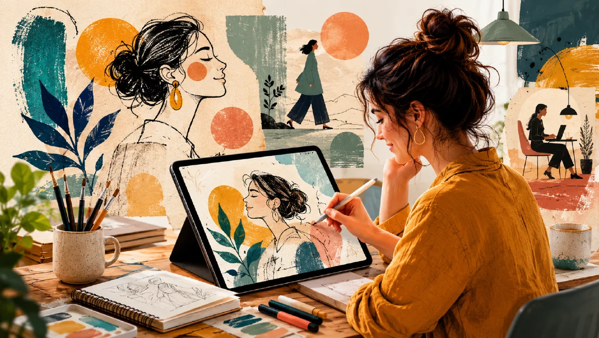
Tactile illustration AI prompts are useful when a brand visual needs to feel human, not machine-polished. After years of glossy gradients, perfect vectors, and smooth 3D mascots, many visual systems are moving back toward rough line work, imperfect silhouettes, textured fills, brush marks, paper grain, and simplified shapes that feel touched by a person.
This does not mean messy. Tactile illustration is controlled imperfection. It can be minimal, elegant, and premium when the prompt defines line weight, texture, palette, composition, and the amount of handmade irregularity.
Use this guide with AI style extraction prompts, AI color grading prompts, and negative prompts for AI image quality.
Decide what kind of touch you want
There are many tactile illustration directions. A rough marker drawing feels different from a minimal black silhouette. A crayon-like texture feels different from ink wash. A handmade editorial illustration feels different from a friendly product onboarding graphic.
Choose one tactile system:
- thick rough line art
- minimal black silhouette
- simplified cutout forms
- loose hand-drawn character art
- textured brush shapes
- pencil and paper grain
- imperfect geometric icons
Then write the prompt around that system.
Example:
Hand-drawn brand illustration of a small team arranging colorful idea cards on a table, thick rough black line art, flat warm color fills, visible paper grain, slightly uneven shapes, friendly editorial composition, no glossy vector polish.
The prompt defines both the subject and the material attitude.
Imperfection should be specific
The word "imperfect" is too broad. It can produce broken anatomy, dirty artifacts, or random distortion. Name the exact imperfection you want.
Useful phrases:
- "slightly uneven hand-drawn outlines"
- "organic asymmetry in the shapes"
- "visible dry brush texture"
- "paper grain showing through flat color"
- "rough marker edge, not perfectly vectorized"
- "small registration-like color offsets"
Avoid:
- "bad drawing"
- "messy anatomy"
- "distorted hands"
- "chaotic sketch"
Human texture should make the image feel more trustworthy, not less competent.
Match line, fill, and palette
Tactile illustration falls apart when line style, fill style, and color style point in different directions. A rough ink line with glossy gradient fills feels confused. A soft pencil sketch with neon cyberpunk colors may work, but only if the contrast is intentional.
Build a matched system:
Line: thick black rough outlines
Fill: flat muted colors with slight paper texture
Palette: warm cream, tomato red, forest green, dusty blue, charcoal
Background: off-white paper
Or:
Line: no outline, minimal black silhouette shapes
Fill: solid black and one warm accent
Palette: cream, black, ochre
Background: clean negative space
This kind of block is useful when generating a series because it prevents the model from changing illustration language between assets.
Use simple scenes for brand clarity
Tactile illustration often appears in brand storytelling: onboarding, feature explainers, blog covers, social posts, product education, and campaign concepts. The best scenes are clear enough to read in a small card.
Good subjects:
- a creator arranging a storyboard
- a product team sorting feedback notes
- hands passing a small object
- a person looking at a glowing idea card
- a simple city block with friendly signage
- tools, notebooks, plants, and icons on a desk
- silhouettes of users moving through a service journey
If the idea is abstract, represent it through a physical metaphor. "Trust" can become hands holding a shared object. "Workflow" can become cards moving across a table. "AI generation" can become rough sketches turning into a finished picture.
Minimal silhouettes can feel premium
Not every tactile illustration needs visible lines. Minimal silhouettes can feel calm and editorial when the shapes are slightly organic.
Prompt example:
Minimal tactile illustration of a founder standing beside a large abstract product shape, black organic silhouette forms on warm cream paper, one muted violet accent, rough paper grain, quiet negative space, premium editorial feel.
The key is restraint. Silhouettes need strong composition because there are fewer details. Use negative space, scale contrast, and one accent color.
Preparing for motion
Tactile illustration can move well when animation respects the handmade material. Small gestures, sliding cards, line wiggle, paper texture shimmer, and stop-motion-like movement work better than complex camera flights.
Video prompt:
The hand-drawn character raises one arm slightly, rough line art wobbles subtly like frame-by-frame animation, paper grain remains visible, background stays still, no glossy 3D motion.
Another:
Illustrated idea cards slide across the table one by one, small offset shadows and dry brush texture preserved, calm editorial animation.
Generate the still first, then use image-to-video for simple motion that protects the illustration style.
Common mistakes
The first mistake is asking for handmade texture and ultra-polished rendering in the same prompt. Choose the material.
The second mistake is letting imperfection affect anatomy or meaning. Ask for uneven line edges, not broken hands.
The third mistake is overcomplicating the scene. Tactile illustration works best when the idea is simple and the material carries the charm.
The fourth mistake is ignoring the brand palette. Handmade visuals can still be systematic. Define colors and reuse them.
Try it in Naviya
Start with Naviya AI Image Generator and write the illustration system before the subject details: line style, fill style, paper texture, palette, and composition. Once the system is stable, generate a few scenes with the same block. For motion, move to Naviya Image to Video and animate only one or two elements.
Brand system workflow
Tactile illustration works best when it becomes a small visual system, not a single charming image. Define reusable rules before generating a full set.
Create a style card:
- Line: rough pencil, soft ink, cut-paper edge, or dry brush.
- Fill: flat color, uneven wash, grainy crayon, or layered paper.
- Palette: three core colors plus one accent.
- Shape: rounded, angular, naive, geometric, or organic.
- Texture: paper tooth, ink bleed, imperfect registration, or hand-colored grain.
- Layout: centered icon, small scene, editorial spot, or poster composition.
Then test the same style card on three subjects: a product, a person, and an abstract service idea. If one subject breaks the system, simplify the rule that caused the break. For example, heavy paper texture may work on a poster but make a small product icon muddy. Rough lines may feel warm on lifestyle scenes but too casual for a premium technical product.
For campaigns, combine tactile stills with clean motion. A paper edge can lift, a drawn line can reveal, or a shadow can move across the illustration. Avoid full-scene transformation unless the brand can support a playful tone. The AI style extraction prompts guide can help turn one successful image into a repeatable prompt block.
For production review, print the style card beside the generated set. If one image relies on a different line weight, paper texture, or palette, either regenerate it or promote that difference into a deliberate second style. Consistency is what makes handmade texture feel like a brand choice instead of an accident.
That same style card should travel with any motion version so animators preserve the handmade constraints.
Prompt block:
Illustration system, line quality, fill texture, palette, simple brand scene, composition, controlled imperfection, avoid glossy vector polish and broken anatomy.
Tactile illustration works because it replaces anonymous perfection with visible human judgment. The prompt should define that touch with precision.