2026-06-12
Dreamy Pastel Color AI Prompts: Soft Light, Nostalgia, and Gentle Worlds
Write dreamy pastel color AI prompts for soft illustrated scenes, nostalgic light, gentle palettes, and warm image-to-video first frames.
Try this workflow in Naviya
Start from a finished image when the subject, style, or composition should stay stable.
Animate a still image
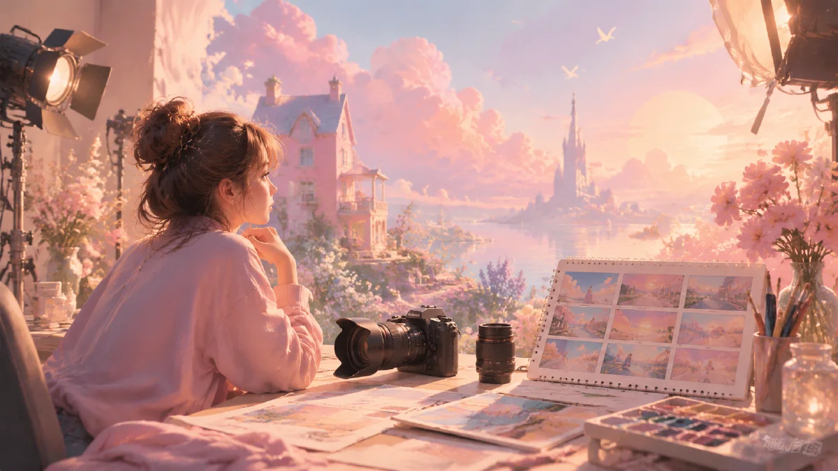
Dreamy pastel color AI prompts are useful when you want warmth without heavy realism, nostalgia without sepia, and softness without losing the subject. The style often resembles a gentle illustrated world: low contrast, soft bloom, watercolor texture, natural sunlight, shallow focus, smooth gradients, and a color palette that feels like a memory rather than a photograph.
This is a strong direction for children's brands, wellness visuals, lifestyle scenes, soft product launches, romantic landscapes, music covers, and first frames for calm motion pieces. It can also balance more technical AI outputs by making them feel handmade and emotionally approachable.
Use this guide with AI color grading prompts, cinematic atmosphere AI prompts, and AI style extraction prompts.
Soft does not mean vague
Many pastel prompts fail because they only say "soft, dreamy, beautiful, pastel." The model responds with washed-out colors, low detail, or generic cute imagery. A better prompt names the light, palette, texture, focus, and scene relationship.
Use this structure:
Subject + gentle environment + pastel palette + soft light source + texture + focus behavior + emotional tone.
Example:
A child standing at the edge of a wildflower field after rain, soft pastel illustration, pale green grass, powder blue sky, peach and coral flowers, gentle backlight through mist, low contrast, watercolor texture, shallow depth of field, warm nostalgic mood, subject clearly readable.
The prompt is gentle, but it is not vague. It gives the model visible decisions.
Build the palette around nature
Dreamy pastel color often works best when the palette comes from natural elements: grass, sky, flowers, sunlight, sea foam, clouds, rain, skin, and warm highlights. This keeps the image from looking like a random candy palette.
Useful palette blocks:
Pale green grass, powder blue sky, cream clouds, soft peach sunlight, small coral flower accents.
Muted lavender shadows, warm butter-yellow highlights, faded rose clothing, soft gray-blue background.
Seafoam green water, pale sand, soft turquoise sky, warm orange rim light on the subject.
Keep saturation moderate. If every color is bright, the result becomes toy-like. If every color is pale, the image loses focus. Use one or two slightly stronger accents to guide the eye.
Light creates the haze
Dreamy color depends on light behavior. Use gentle sunlight, misty backlight, soft overcast glow, low contrast, or bloom around bright edges. Avoid harsh noon light unless you want a stylized summer poster.
Good light phrases:
- "soft morning sunlight diffused through thin mist"
- "gentle backlight creating a pale glow around the subject"
- "overcast daylight with lifted shadows"
- "warm late-afternoon light, low contrast, no harsh shadow"
- "soft bloom around highlights, not overexposed"
The phrase "not overexposed" matters. Dreamy outputs can blow out whites and remove detail. Ask for soft highlight roll-off and readable subject edges.
Texture makes it feel handmade
Pastel dream worlds can be photographic, illustrated, or somewhere between. Decide how handmade the image should feel.
For illustration:
soft pastel illustration, watercolor paper texture, smooth gradients, lightly visible brush grain, gentle edges.
For nostalgic photography:
analog film look, low contrast, fine film grain, slight halation, soft focus background.
For hybrid editorial work:
illustrated color treatment over realistic composition, matte surfaces, no glossy CGI, natural proportions.
Texture should support the subject. A children's book scene can have more visible paper texture. A product still may need a cleaner matte finish with only subtle grain.
Use focus to preserve clarity
Soft prompts can accidentally blur everything. Instead, define selective softness.
Try:
subject in clear focus, background flowers dissolve into soft pastel bokeh.
face and hands remain sharp, edges of the scene fade into dreamlike haze.
foreground grass slightly blurred, subject crisp, distant trees softly washed by light.
This creates a memory-like frame without sacrificing readability. It also helps when the still will become video, because a stable focus hierarchy gives the motion model a clear anchor.
Scene ideas that fit the style
Dreamy pastel color works especially well in scenes with gentle movement and open air:
- beach walks at sunrise
- wildflower fields
- rain-washed streets
- forest paths with soft light
- children playing in a quiet yard
- pets near a window
- bicycles on empty roads
- picnic blankets, books, fruit, and paper objects
- soft product scenes with fabric and flowers
The scene should have room for light. Cramped interiors can work, but add a window, curtain, lamp, or doorway that explains the glow.
Turning stills into calm video
Dreamy pastel frames should move slowly. Good video actions include drifting curtains, grass swaying, petals moving, a character turning slightly, rain falling softly, sunlight shifting, or camera drifting forward.
Prompt example:
The camera slowly pushes through the flower field toward the subject. Grass and flowers move gently in the breeze, soft backlight stays consistent, pastel color remains low contrast, no sudden camera shake.
If the still image is highly illustrated, ask for subtle motion rather than full physical realism. The goal is to preserve the soft world, not turn it into a busy action scene.
Common mistakes
The first mistake is overusing blur. Dreamy images need clear focal points.
The second mistake is making the palette too sweet. Add muted greens, cream, soft gray, or pale blue so the image has air.
The third mistake is forgetting the light source. Haze and bloom need a reason.
The fourth mistake is using too much contrast in post-processing language. HDR, ultra-sharp, glossy, and high saturation will fight the style.
Where pastel prompts work best
Dreamy pastel color is strongest when the subject already supports softness. Beauty products, spring fashion, baby-room decor, cafe scenes, wedding details, quiet travel, wellness routines, and lifestyle portraits all benefit from gentle palettes. The style is weaker for subjects that need hard contrast, aggressive action, industrial grit, or technical precision.
Use pastel as a world-building tool, not just a color request. Place pale peach in the sky, dusty lavender in the shadow, soft mint in the plant leaves, and warm cream in the highlights. This gives the model a physical map. If the result becomes washed out, add one slightly deeper anchor color such as muted olive, cocoa gray, or soft navy in the background. The anchor helps the subject stay readable.
For motion, keep the palette stable. Ask for drifting curtains, flower movement, slow handheld camera, or sunlight shift rather than sudden color changes. Pastel videos usually feel better when the movement is calm enough for the viewer to notice texture.
If the image feels too soft, add one crisp detail: an eye highlight, product edge, jewelry reflection, fabric seam, or window line. Dreamy does not mean unfocused everywhere.
Try it in Naviya
Start in Naviya AI Image Generator with a scene that has natural light and a clear subject. Write the palette as specific colors assigned to the environment. Once the still feels warm and coherent, use Naviya Image to Video for gentle motion: wind, drift, small gestures, or soft camera movement.
Use this prompt block:
Subject, natural environment, pastel palette with placement, soft light source, handmade or analog texture, selective focus, gentle emotion, avoid harsh contrast and plastic shine.
Dreamy pastel color is not just a filter. It is a low-pressure visual world where light, texture, and color make the subject feel remembered.