2026-06-12
AI Brand Visual System From One Product Photo
Build a practical brand visual system from one product photo using AI images, style directions, product scenes, banners, and campaign assets.
Try this workflow in Naviya
Use the guide to shape a still image, then keep it as a first frame or campaign asset.
Open the studio
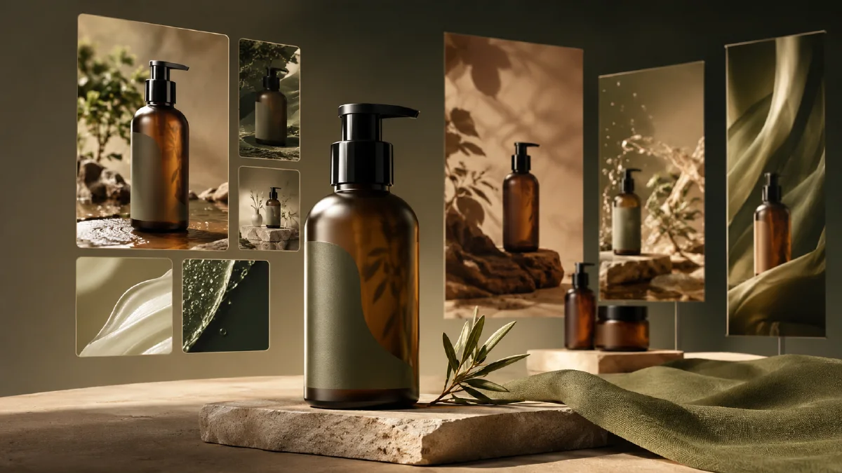
An AI brand visual system is a repeatable set of image rules, scene types, colors, compositions, and campaign formats that help a product look consistent across store pages, ads, social posts, and launch graphics. It can begin with something very small: one clean product photo.
That starting point matters. A clear product image gives the AI a stable anchor for shape, material, color, and scale. From there, you can generate multiple visual territories without building 3D models, booking a studio, or waiting for a full shoot. The workflow is especially useful for early-stage ecommerce brands, campaign testing, and teams that need a polished first pass before investing in final production.
Use AI Image Generator for still assets, Reference to Video when you need consistent motion from approved visuals, and AI Video Ads when the system needs campaign cuts. For deeper prompt control, pair this with AI style extraction prompts, AI product scene generation, and reference image prompting guide.
Definition
A brand visual system is the practical image language of a brand. It answers questions like: What backgrounds do we use? How close is the camera? Is the lighting soft, dramatic, clinical, playful, or editorial? What colors repeat? How much empty space do we leave for copy? What does a product hero image look like compared with a social image?
AI does not remove the need for these choices. It makes it faster to explore them.
Start with the product anchor
Choose a product image with:
- Clean outline.
- Even lighting.
- Minimal background clutter.
- Accurate color.
- Visible material details.
- No heavy perspective distortion.
A white-background product photo is ideal, but a simple studio image can work. If the product is reflective, transparent, or text-heavy, include strict preservation instructions in every prompt.
Product anchor template:
Use the uploaded product image as the hero product reference.
Preserve: product shape, color, proportions, material, label area, and key details.
Do not invent new logos, unreadable text, extra product parts, or altered packaging.
Choose three visual territories
Do not generate random assets first. Define three territories. Each territory should have a strategic purpose.
| Territory | Best for | Visual language |
|---|---|---|
| Premium studio | Website hero, launch page, paid ads | Dark or clean backdrop, controlled light, strong product focus |
| Lifestyle scene | Social, email, product page | Product in realistic context, human use, warm details |
| Campaign world | Seasonal drops, banners, key visuals | More symbolic, colorful, surreal, or editorial |
This gives you range without losing control. A skincare brand might test "clinical glass studio," "morning bathroom ritual," and "botanical ingredient world." A tech accessory brand might test "black acrylic studio," "desk setup lifestyle," and "futuristic motion graphics."
Generate the first asset set
For each territory, create a small pack:
- Hero product image.
- Detail close-up.
- Lifestyle scene.
- Banner composition with copy space.
- Social square or vertical post.
Prompt template:
Create a brand visual system asset for this product.
Territory: [premium studio, lifestyle scene, campaign world]
Asset type: [hero, detail, lifestyle, banner, social post]
Product: use the uploaded image as the product reference.
Composition: [centered, macro, diagonal, wide banner, vertical social]
Lighting: [soft daylight, dramatic rim light, clean high key, warm editorial]
Color mood: [specific palette]
Copy space: [top-left, right side, bottom band, none]
Constraints: preserve product shape, color, material, and proportions. No extra logos, no fake text.
Generate several options, then select the best image from each asset type. The goal is not to keep everything. The goal is to find the rules that feel repeatable.
Build rules from winners
After you have 10 to 20 usable images, write down the rules you see in the winners:
- Background types.
- Dominant colors.
- Shadow style.
- Camera distance.
- Product angle.
- Props.
- Amount of negative space.
- Typography placement area.
- Motion potential.
These rules become your brand visual system. Keep them simple enough for anyone on the team to use.
Example:
| Rule | Decision |
|---|---|
| Background | Black acrylic, soft reflections, no clutter |
| Light | Violet rim light plus warm front fill |
| Camera | Low angle for hero, macro for material |
| Copy | Right-side negative space on banners |
| Props | Only one functional prop per scene |
| Motion | Slow push-in or light sweep, no chaotic movement |
Convert stills into motion
Once a visual system exists, video becomes easier. You are not inventing a new world for every clip. You are animating approved compositions.
Use Image to Video for product-safe motion:
Animate this brand hero image into a 5 second product clip.
Camera: slow push-in with subtle parallax.
Motion: product stays stable while reflections and light move gently.
Style: consistent with the approved brand visual system, premium, clean.
Constraints: preserve product shape, color, material, label area, and scale.
For campaign variants, use AI Video Ads to test different hooks while keeping the same visual rules.
When to use this workflow
This approach is useful when:
- A new brand needs a first visual direction.
- A product launch needs banners, social posts, and ads quickly.
- A store wants to test several audience angles.
- A small team needs more assets than a single shoot can provide.
- A product has many SKUs that must feel consistent.
It is less suitable when exact packaging text, regulated claims, or manufacturing specifications must be final inside the image. In those cases, generate clean visuals and add approved text in the design layer.
Turn one system into campaign assets
Once the first visual territory works, build a compact asset map instead of producing random variants. Start with a hero image that shows the full product. Add one close-up for material or texture, one lifestyle frame for use context, one clean banner crop with copy space, and one motion-ready frame where the product sits clearly in the center. This gives the marketing team enough range without losing recognition.
For ecommerce, keep the product color and silhouette stricter than the background. For paid social, let the environment carry more emotion, but keep the product visible in the first second. For launch emails or landing pages, prioritize negative space and a stable lighting rule so designers can place real copy later. The system becomes useful when every asset feels related, not when every image looks identical.
Name the rule behind each winning image before making more variants. For example: "violet rim light on black acrylic," "warm bathroom tile with soft reflection," or "floating product on pale gray with sharp shadow." A named rule is easier to reuse than a favorite output.
Try it in Naviya
Upload one clean product photo to AI Image Generator. Create three visual territories, select the strongest five assets, then animate the best hero image with Reference to Video. For campaign testing, expand the system in AI Video Ads.
Brand system checklist
Before using the assets widely, confirm:
- The product is accurate in every winning image.
- The system has at least one hero, one detail, one banner, and one lifestyle format.
- The visual rules can be repeated across future SKUs.
- There is enough copy space for real ecommerce layouts.
- The style supports both still images and short video.
A brand visual system does not have to start as a large identity project. It can start as a disciplined product-image workflow: anchor the product, explore the right territories, select repeatable rules, and turn the best stills into motion.