2026-06-12
Minimalist Beauty Packaging with AI: Prompt a Premium Box Design
Design minimalist beauty packaging concepts with AI using box shape, recycled paper texture, embossing, foil, negative space, and practical iteration.
Try this workflow in Naviya
Use the guide to shape a still image, then keep it as a first frame or campaign asset.
Open the studio
Minimalist beauty packaging looks simple only when the decisions are precise. Box shape, paper texture, finish, embossing, foil, white space, and photography style all have to work together. AI can explore these directions quickly, but premium packaging prompts need production-minded language rather than vague requests for "clean luxury."
The practical definition: an AI packaging concept is a generated visual that explores form, material, print finish, and brand mood before final design production. It is useful for mood boards, campaign visuals, concept decks, and early packaging direction. It should not replace final dielines, regulatory copy, print files, or production artwork.
For related product scene work, read AI product scene generation. For reference control, use reference image prompting. If the packaging will later appear in motion, connect it to AI product photography to video.
Start with the physical object
Many packaging prompts fail because they begin with mood instead of construction. Start with the object:
- Box type: square folding box, sleeve, drawer box, rigid box, tube carton.
- Material: uncoated recycled cardboard, matte coated paper, textured cotton paper.
- Finish: matte, frosted, soft-touch, raw paper.
- Print process: embossing, debossing, hot foil, spot UV, blind stamp.
- Photography: pure white background, tabletop scene, flat lay, angled product shot.
Once the physical object is clear, add the brand feeling.
Base prompt
Minimalist cosmetic packaging box design,
square folding box shape, uncoated recycled cardboard texture,
matte white finish, clean lines, pure white background,
product photography, high detail, premium beauty brand concept.
This base prompt controls the box, material, finish, background, and category. It gives you a clean starting point before adding visual identity.
Add quiet luxury through finish, not clutter
Minimal beauty packaging often uses restraint. Instead of filling the box with graphics, use print effects:
Minimalist cosmetic packaging box design,
square folding box shape, uncoated recycled cardboard texture,
matte warm white finish, clean negative space,
subtle embossed abstract line pattern inspired by calm natural movement,
blind debossed detail, delicate hot gold foil accent,
pure white background, high-detail product photography,
premium sustainable beauty packaging concept.
The important phrase is "subtle embossed abstract line pattern." It suggests visual interest without turning the box into a poster.
Use Eastern-inspired negative space carefully
If the brand wants an Eastern-inspired feeling, describe the design principles rather than copying specific cultural symbols. Use ideas such as balance, quiet white space, natural rhythm, brush-like abstract line, stone, water, paper texture, and restrained gold.
Prompt example:
Minimalist beauty packaging concept with calm Eastern-inspired negative space,
matte white square folding box, uncoated recycled paper texture,
very subtle embossed flowing line pattern, small warm gold foil accent,
refined balance, clean product photography, soft natural shadow,
premium natural skincare brand mood.
This approach feels refined and avoids overusing obvious motifs.
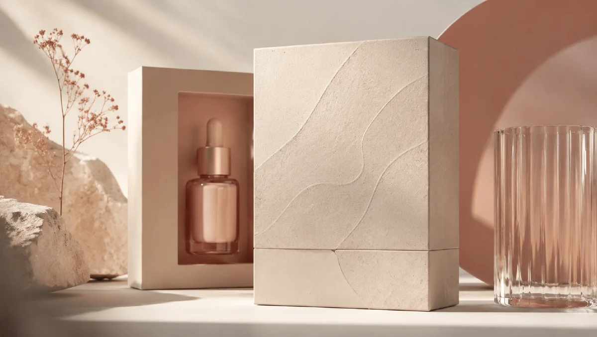
Pair box and bottle
Packaging often needs to be seen with the primary container:
Premium beauty packaging scene with a matte white square folding box
and a jade-tinted frosted glass bottle beside it.
Uncoated recycled cardboard texture, subtle embossed abstract line pattern,
small hot gold foil accent, soft natural light, clean white background,
minimal luxury skincare product photography.
The bottle adds material contrast. Frosted glass next to matte paper can feel tactile and premium.
Iteration workflow
Use a three-pass workflow:
| Pass | Goal | Prompt focus |
|---|---|---|
| 1. Form | establish box shape and material | square folding box, recycled paper, matte finish |
| 2. Finish | add print process | embossing, debossing, foil, spot detail |
| 3. Brand mood | refine visual language | negative space, natural rhythm, premium beauty |
Do not try to solve everything in the first prompt. A simpler first pass gives you a cleaner object to refine.
Prompt controls for print effects
| Print effect | Prompt phrase |
|---|---|
| Raised texture | "subtle embossed pattern" |
| Recessed texture | "blind debossed lines" |
| Metallic detail | "small hot gold foil accent" |
| Gloss contrast | "spot UV on minimal line artwork" |
| Paper realism | "uncoated recycled cardboard texture, visible paper fibers" |
| Soft luxury | "matte finish, warm natural shadow, refined negative space" |
If the model makes the foil too loud, add "very small" and "restrained." If it adds fake text, add "no readable text, no random typography."
Commercial constraints
AI packaging concepts are not final production files. Use them for direction, then translate the chosen idea into real artwork with correct dimensions, legal copy, barcode, ingredients, claims, and printer specifications.
Before sharing concepts with stakeholders, label them as concept visuals in your deck. The useful question is not "can we print this exact image?" The useful question is "which material and finish direction should we develop?"
Build a packaging comparison board
Generate three controlled routes instead of twenty unrelated images:
| Route | Material | Finish | Mood |
|---|---|---|---|
| Pure minimal | warm white paper | blind embossing | calm, clinical, premium |
| Natural craft | recycled fiber paper | debossed lines | sustainable, tactile, gentle |
| Quiet luxury | matte coated paper | small gold foil | refined, giftable, high value |
Show the same box angle for each route. This makes comparison easier because stakeholders evaluate material and finish rather than being distracted by different camera angles. Once a route wins, generate secondary views, bottle pairings, and campaign scenes.
Check the design at small size
Packaging concepts often look refined in a large render but disappear as a product thumbnail. Zoom out and check whether the silhouette, material, and one memorable detail still read. If the embossed pattern only works at full screen, add a slightly clearer paper texture, stronger shadow, or a more visible foil accent. Minimal does not mean invisible.
Keep typography out until the system is ready
Early AI packaging concepts are strongest when they focus on form, texture, and finish. Random generated typography can distract from the decision you are trying to make. Use "no readable text" during the exploration stage, then add real typography in a design tool after the material direction is chosen. This keeps stakeholders from reacting to accidental words or fake labels.
Turn packaging into campaign visuals
Once you have the packaging direction, create supporting visuals:
- Product box on clean white background.
- Box plus bottle on stone or paper.
- Macro detail of embossed lines.
- Packaging held in hand.
- Packaging with ingredient or texture scene.
- Short motion clip with light gliding over foil.
Motion prompt:
Camera slowly pushes in on the minimalist beauty packaging box.
Soft light moves across the embossed line pattern and small gold foil accent.
Box remains stable, paper texture visible, clean premium atmosphere.
Try it in Naviya
Use Naviya Image Generator to explore box shapes, materials, and finish directions. Use Naviya Reference to Video when animating an approved concept, or Naviya Image to Video for simple light-sweep packaging motion. For ad-ready scenes, test variations in Naviya AI Video Ads.
Final checklist
Before choosing a concept, check:
- Box shape is clear and plausible.
- Material texture supports the brand.
- Print effects are subtle and readable.
- Negative space feels intentional.
- The design avoids random fake text.
- The concept can translate into real packaging production.
- Supporting campaign images can use the same palette and finish language.
Minimalist packaging is not empty packaging. It is packaging where every visible decision earns its place. AI can help you explore those decisions quickly when your prompts speak the language of box structure, paper, finish, and restraint.