2026-06-12
Y2K and 90s AI Poster Workflow for Blue Chrome Campaign Visuals
Turn portraits and product photos into 90s and Y2K campaign visuals with cold blue color, chrome texture, CRT scan lines, blur, grain, and retro tech typography.
Try this workflow in Naviya
Use the guide to shape a still image, then keep it as a first frame or campaign asset.
Open the studio
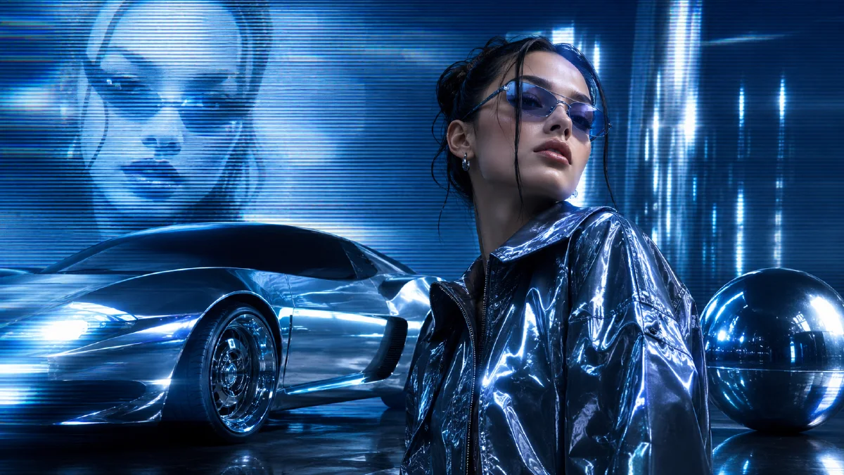
The strongest Y2K and 90s AI visuals are not just nostalgic. They are systems of color, texture, compression, typography, and surface finish. Cold blue light, chrome, translucent plastic, scan lines, soft glow, film grain, and small technical data blocks can turn a simple portrait or product photo into a campaign poster that feels like a late-90s electronics ad, CD cover, or early digital fashion spread.
This workflow is useful for music releases, fashion drops, creator portraits, tech product teasers, and short vertical ads. Use Naviya AI Image Generator for poster frames, AI Video Generator for motion graphics, and Image to Video when you want a still poster to become a moving social clip. For related visual systems, read Y2K AI style prompts, holographic dot matrix AI prompts, and hex color grading AI prompts.
What defines the Y2K 90s tech look?
The look comes from a set of repeatable ingredients, not one keyword. A good Y2K poster usually combines:
- Cold blue, cyan, and ice-white highlights.
- Brushed chrome, silver metal, glossy plastic, or translucent surfaces.
- Low-resolution or 480p texture cues.
- Soft focus, glow halos, lens flare, and motion blur.
- Film grain, CRT scan lines, subtle grid overlays, and compression artifacts.
- Futuristic minimal typography, barcodes, serial numbers, and small data blocks.
- Japanese consumer electronics ad energy or CD album cover composition.
The trick is balancing polish and degradation. If the image is too clean, it looks like a generic futuristic poster. If it is too degraded, it becomes unreadable. The premium version keeps the subject clear while letting the texture system carry nostalgia.
Two ways to build the effect
There are two practical approaches.
| Method | Best for | Control level |
|---|---|---|
| Trend effect workflow | Fast creator output from one photo | Medium |
| Prompt-controlled workflow | Campaigns, product visuals, brand systems | High |
The fast method is useful when speed matters. Upload a photo into a trend effect and generate several versions. The prompt-controlled method is better when you need a consistent brand look across multiple visuals.
The prompt-controlled formula
Use this structure:
Change the image into a 90s retro Y2K cyber-futurist poster.
Preserve [subject identity/product shape].
Visual quality: 480p retro texture, 1999 tech commercial photography,
monochrome cold blue and cyan palette, ice-white highlights.
Surface: glossy translucent plastic, silver chrome, metallic texture.
Effects: soft focus, glowing halo, heavy motion blur, lens flare,
film grain, CRT scan lines, subtle grid overlay.
Typography: minimal futuristic layout, barcodes, small technical text
data blocks, CD album cover atmosphere, high contrast.
Aspect ratio: [ratio].
Full prompt:
Change this image into a 90s retro Y2K cyber-futurist campaign poster.
Preserve the main subject and recognizable pose. Use 480p texture and
1999 retro technology commercial photography. Create an immersive
monochrome cold blue and cyan palette with ice-white highlights.
Add soft focus, glowing halos, heavy motion blur, strong lens flare,
glossy translucent plastic, silver chrome, and metallic surfaces.
Add heavy film grain, CRT scan lines, and subtle grid overlay.
Integrate minimal futuristic typography, barcode elements, and small
technical text data blocks in the background. The result should feel
like a stylish Japanese electronics ad and CD album cover, high contrast.
Build a reusable visual system
If you need more than one poster, define a visual system before generating variations.
| System layer | Decision |
|---|---|
| Color | cold blue, cyan, ice white, black, silver |
| Texture | grain, scan lines, compression, soft glow |
| Material | chrome, translucent plastic, brushed metal |
| Type | tiny tech labels, barcode blocks, grid coordinates |
| Composition | centered portrait, diagonal product, CD cover crop |
| Motion version | zoom, flicker, scan-line drift, light sweep |
This prevents the AI from wandering into unrelated nostalgia such as vaporwave sunsets, arcade neon, or grunge magazine collage.
Subject-specific prompt adjustments
For a portrait:
Preserve the person's face, hairstyle, and pose. Add cold blue
backlight, chrome reflections around the edges, soft camcorder glow,
CRT scan-line texture, and minimal technical typography behind the
subject. Keep the face readable and avoid heavy distortion.
For a fashion image:
Preserve the garment silhouette, fabric, and styling. Turn the image
into a 1999 fashion-tech poster with icy cyan color, silver chrome
micro-graphics, slight film grain, soft blur, and CD cover layout.
For a product:
Preserve the product shape and logo area. Use glossy translucent
plastic, brushed chrome surfaces, cold blue studio lighting, small
technical labels, barcode placeholders, scan lines, and high-contrast
commercial poster composition.
Turn the poster into video
The easiest motion is not character animation. It is poster motion: scan lines drift, chrome highlights slide, data blocks flicker, and the camera pushes in slowly. This keeps the visual identity stable.
Video prompt:
Create a 5 second Y2K tech poster motion clip from this image.
Camera slowly pushes in. Cold blue chrome highlights sweep across the
subject. CRT scan lines drift subtly. Small technical data blocks
flicker softly in the background. Film grain and soft glow remain
stable. Preserve the subject identity and poster layout.
For social ads, combine three clips: a slow poster push-in, a fast zoom on the subject, and a final product or title card.
Common mistakes
| Mistake | Fix |
|---|---|
| Too much neon | Use cold blue and ice white instead of rainbow color |
| Subject becomes blurry | Specify preserve subject, readable face or product |
| Typography becomes fake headline text | Ask for small technical data blocks and barcode elements |
| Poster feels modern, not retro | Add 480p texture, CRT scan lines, film grain, CD cover mood |
| Style varies across assets | Reuse the same color, texture, and material system |
Try it in Naviya
Upload a portrait, product image, or fashion frame to Naviya AI Image Generator and apply the Y2K system as a style prompt. When the poster is stable, use Image to Video for a slow chrome highlight sweep or AI Video Generator for a complete campaign motion sequence.
Motion ideas for Y2K campaign sets
A Y2K poster system can become a short video package without animating the person or product heavily. Use motion that belongs to the graphic layer. Chrome highlights can sweep from left to right. CRT scan lines can drift downward. Small data blocks can flicker in the background. A barcode can slide into frame as a transition element. The camera can push in, snap zoom, or tilt slightly while the subject remains stable.
For a three-clip social sequence, use a slow poster reveal, a fast detail zoom, and a final title-card hold. The same cold blue, chrome, grain, and typography system should appear in all three clips. That consistency makes the campaign look designed rather than filtered.
When creating a campaign set, save one approved visual as the master direction. Every later image should match its blue temperature, scan-line density, chrome brightness, and typography scale. If one frame becomes warmer, cleaner, or more neon than the master, it will weaken the whole system. Treat the master as a small art-direction board, not just a single output.
Final checklist
Before publishing, check that the subject still reads clearly, the blue chrome palette is consistent, the scan-line texture does not destroy detail, and the typography behaves like design texture rather than readable ad copy. The goal is a premium retro-tech signal, not a noisy filter.