2026-06-12
Risograph Print AI Prompts: Halftone Dots, Misregistration, and Limited Ink
Write Risograph print AI prompts with limited spot colors, halftone dots, paper grain, misaligned ink, and animation-friendly print layers.
Try this workflow in Naviya
Use the guide to shape a still image, then keep it as a first frame or campaign asset.
Open the studio
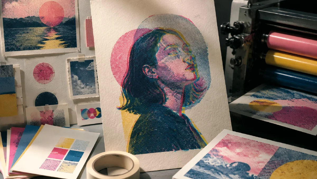
Risograph print AI prompts work when the image behaves like ink on paper, not like a digital filter placed on top of a finished picture. The charm of Riso comes from physical printing logic: limited spot colors, slight registration errors, visible halftone dots, paper fibers, ink overlap, and small imperfections that become the style.
If you only ask for "retro print texture," the model may add a grain overlay. That can look nice, but it will not feel like real Riso. A better prompt describes how colors are printed in separate layers and how those layers misalign, overlap, and reveal paper texture.
Use this guide with AI color grading prompts, controlled chaos AI prompts, and AI style extraction prompts.
Start with print logic
Risograph printing uses separate ink layers. Each color is printed one at a time, so slight misalignment is natural. When two inks overlap, they create new tones. This is the visual logic your prompt should describe.
Use core terms:
- "Risograph print"
- "limited spot colors"
- "duotone" or "tritone printing"
- "misaligned ink layers"
- "registration error"
- "visible halftone dots"
- "ink overlap"
- "textured white paper"
- "Riso grain"
Prompt example:
Risograph print of a quiet city cyclist, duotone spot colors in fluorescent pink and teal, slightly misaligned ink layers, visible halftone dots in the shadows, rough paper grain, minimal graphic composition, ink overlap creating darker purple tones, no glossy digital filter.
The prompt explains the print method, not just the mood.
Choose the number of inks
Two colors create clarity and punch. Three colors create depth. More than three can still work, but the print feeling may weaken if the palette becomes too broad.
Duotone is good for portraits, simple products, icons, posters, and bold social graphics:
duotone Riso print, fluorescent orange and deep indigo only, high contrast, simple silhouette, visible halftone shading.
Tritone is useful for landscapes, detailed illustrations, and richer editorial layouts:
tritone Riso print, aqua blue, warm red, and sunflower yellow spot colors, transparent ink overlap, layered graphic depth, paper texture visible.
Monochrome can feel premium when composition is strong:
monochrome indigo Risograph print, clean architectural subject, high contrast, halftone gradients for shadow, rough cream paper fibers.
Name the ink colors and ask for restraint. Riso is not a full-spectrum digital gradient.
Halftone is structure, not noise
Halftone dots are how print creates tone. They should appear in shadows, gradients, and midtones, not randomly cover every surface.
Use placement:
visible halftone dots in the shadow areas and background gradients, clean solid ink on the main silhouette.
fine halftone pattern used for skin shading, larger dot pattern in the background, paper remains visible in highlights.
If the output becomes dirty, ask for "clean graphic shapes with controlled halftone texture." If it looks too smooth, ask for "visible dot screen and rough ink grain."
Misregistration gives life
Registration error is the slight offset between ink layers. This is one of the signatures of Riso. It creates colored edges and imperfect overlaps.
Use it carefully:
subtle registration error around the edges, pink ink shifted two millimeters to the right, blue ink slightly lower, subject remains readable.
The word "subtle" matters. If the misalignment is too extreme, the image looks broken. If it is absent, the image looks like a flat vector poster with texture.
Misregistration works especially well around faces, hands, typography-like shapes, product edges, and high-contrast silhouettes.
Convert photos into Riso-inspired graphics
When using a realistic image as a starting point, ask for simplification. Riso does not preserve every photographic detail. It reduces the image into printable values.
Prompt structure:
Convert this subject into a Risograph poster, simplify details into bold graphic shapes, use limited spot colors, preserve the main silhouette, add halftone shading and slight registration error.
For portraits, protect the eyes or profile. For products, protect the outline and logo area. For architecture, preserve geometry and let halftone handle shadow.
Avoid asking for photorealism and Riso at the same time. A Riso image can begin from a photo, but the final result should feel printed.
Prepare layers for motion
Riso style can animate beautifully because the ink layers can move independently. A subtle offset, jitter, or paper wobble can make the print feel alive without breaking the design.
Video prompt:
Preserve the Risograph print style. The pink ink layer jitters slightly out of registration while the blue layer remains stable, halftone dots and paper grain remain visible, low frame-rate stop-motion feel, no 3D camera move.
Another:
The printed paper texture gently shifts as if filmed by hand, small ink misalignment pulses at the edges, subject remains a flat graphic poster.
Use image-to-video after the still is already working. Keep motion flat and print-like. Large camera moves or realistic depth can destroy the poster quality.
Common mistakes
The first mistake is treating Riso as a filter. Describe ink layers, halftone, paper, and registration.
The second mistake is using too many colors. Limit the palette to two or three spot colors unless you have a clear reason.
The third mistake is overusing texture. Riso has grain, but it also has strong graphic shapes.
The fourth mistake is making the image glossy. Use matte paper, visible fibers, and ink absorption.
The fifth mistake is adding complex lighting language. Riso can imply light through printed values, but it should not look like a rendered 3D scene.
Brand uses and proofing checklist
Riso-inspired prompts are useful for more than posters. They can create social cards, event graphics, album covers, editorial headers, packaging concepts, and brand campaign textures. The trick is to keep the print logic visible while still making the asset usable.
Before approving an image, check:
- Does the piece use a limited ink set rather than a full digital gradient?
- Are halftone areas placed intentionally?
- Does the registration offset feel controlled, not broken?
- Is the main subject readable at mobile size?
- Would the image still work if cropped to square or vertical?
- Are any text areas added later in design software instead of generated as tiny unreadable type?
For commercial work, create one clean hero image and one more experimental version. The clean version should carry the message. The experimental version can push ink overlap, paper grain, and color vibration. If the style will become motion, animate only subtle layers: paper texture, ink shimmer, camera drift, or background parallax. Use AI Image Generator for still exploration, then Image to Video for restrained movement. For broader prompt craft, pair it with cinematic atmosphere prompts when light and mood matter more than graphic flatness.
Try it in Naviya
Create a clean poster-style still in Naviya AI Image Generator. Choose the subject, two or three ink colors, halftone placement, and registration behavior. Once the still feels like a printed object, animate it through Naviya Image to Video with tiny layer jitter, paper movement, or low-frame-rate print motion.
Prompt block:
Subject, Riso print method, two or three spot colors, halftone placement, registration error amount, paper texture, graphic composition, avoid glossy filter and full-color gradients.
Risograph aesthetics are powerful because they turn imperfection into structure. The goal is not to hide the print process. It is to make the process visible.