2026-06-12
AI Smart Watch Ad Images: Turning Lightweight into a Visual Concept
Use AI smart watch ad prompts to translate abstract product benefits like lightness into premium wearable product images.
Try this workflow in Naviya
Turn a product, hook, or campaign idea into short social-ready ad concepts.
Create video ad variants
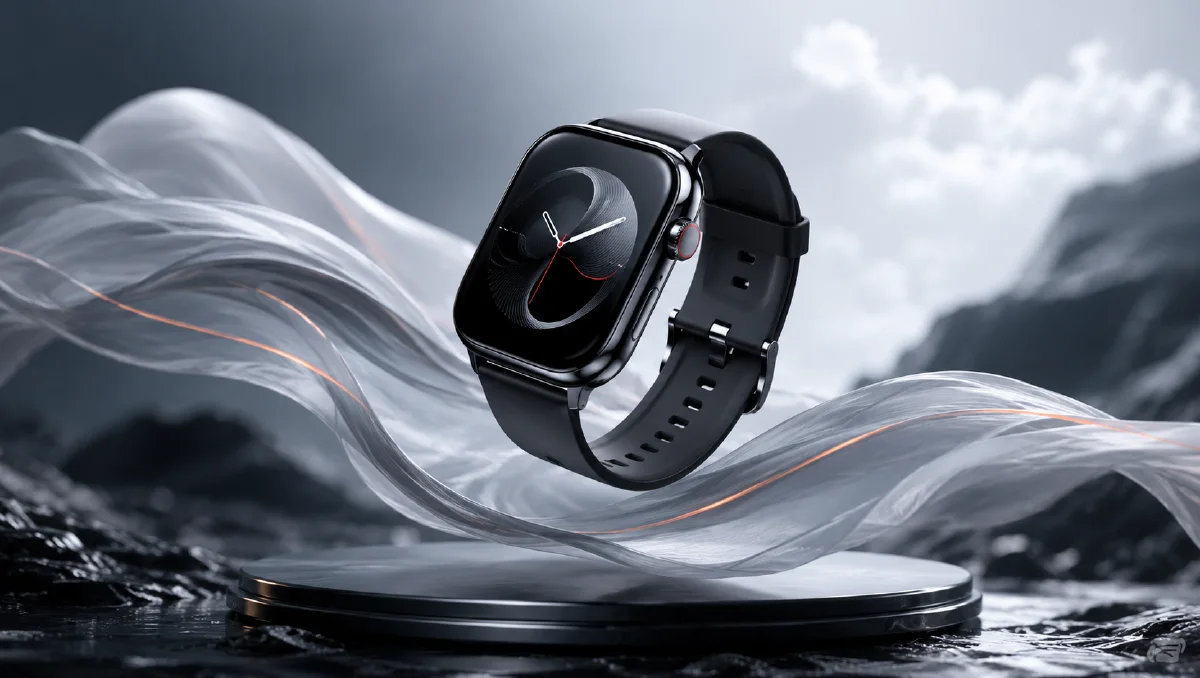
The hardest part of an AI smart watch ad image is not drawing the watch. It is translating the product promise into a visual idea. Words like lightweight, healthy, elegant, durable, precise, and premium are useful in a brief, but they are weak as image instructions unless you turn them into objects, lighting, composition, and atmosphere.
For a lightweight smart watch campaign, the visual metaphor can be simple: a sleek watch floating through soft feathers, morning light, and airy negative space. The product is a dense piece of technology, but the setting makes it feel almost weightless. That contrast is what gives the image a reason to exist.
Start with AI Image Generator for the hero still. If the watch image is already approved, use Image to Video to add a slow floating move. For a full launch clip, move the concept into AI Video Generator. You can combine this guide with AI Product Photography to Video, AI lighting prompts, and cinematic atmosphere prompts.
Translate a feature into a visual metaphor
"Lightweight" is an abstract product claim. AI models respond better when that claim becomes a scene. A feather cloud is useful because it communicates softness, air, delicate motion, and weightlessness without needing explanatory text.
The planning table looks like this:
| Product claim | Visual language |
|---|---|
| Lightweight | Floating watch, feathers, open air, soft negative space |
| Health-focused | Minimal activity rings, calm color, clean typography |
| Premium | Controlled highlights, elegant materials, refined composition |
| Comfortable | Warm light, soft texture, breathable atmosphere |
| Modern | Minimal UI, simple geometry, clean product silhouette |
The image should not show every claim at once. Pick the main message, then let the supporting details reinforce it.
First prompt: clean exploration
Begin with a concept prompt that is broad enough to explore, but specific enough to keep the product readable.
A sleek modern smart watch floating among a cloud of soft white feathers,
highlighting the lightness of the watch, minimalist aesthetic,
clean and airy color atmosphere, young premium product tone,
hyper-realistic product photography, cinematic soft lighting,
strong artistic composition, wide hero image.
This prompt gives the model a strong subject, a metaphor, a product benefit, a style, and a lighting direction. It does not yet force too many details into the screen, strap, logo, or background. The goal is to find the concept and composition first.
When reviewing results, ask four questions:
- Does the watch read instantly?
- Do the feathers support the product instead of hiding it?
- Does the composition leave room for campaign copy?
- Does the image feel light, or just decorative?
If the feathers overwhelm the watch, reduce the density. If the watch looks generic, add material and silhouette details.
Upgrade the atmosphere
The first version may be clean but cold. For wearable products, warmth can make the image feel more human. Instead of saying "make it beautiful," adjust the light and color.
Use:
A sleek modern smart watch floating among soft white feathers,
soft pastel color palette, warm morning light filtering through the scene,
dreamy and ethereal atmosphere, shallow depth of field,
premium wearable product photography, clean airy composition,
minimalist aesthetic, realistic materials, refined highlights.
The upgrades are specific:
- "warm morning light" gives a believable source
- "soft pastel color palette" reduces hard technology coldness
- "shallow depth of field" makes the foreground and background breathe
- "refined highlights" helps metal and glass feel expensive
This is the difference between a prompt that names a mood and a prompt that builds it.
Design the watch screen carefully
A blank watch screen can look unfinished. A busy screen can make the image cheap. The safest direction is a minimal UI: time, date, one activity ring, and a few clean health indicators.
Prompt addition:
The watch screen shows a minimalist health tracking UI,
one elegant activity ring, clean typography for time and date,
dark glass surface, subtle glow, no clutter, no tiny unreadable text.
If the screen is small, do not ask for detailed data. Tiny AI text can break the image. Use simple shapes and readable hierarchy. For final production, you can replace the screen design with real UI in design software.
Add branding without making the image look like a mockup
Brand text should feel placed by a designer, not randomly generated by the model. If the campaign needs a wordmark, put it in negative space or integrate it subtly into the environment.
Prompt direction:
Leave clean negative space in the upper left for brand typography,
no generated text on the product body, elegant premium ad layout.
This is safer than asking the model to write the brand name. If you need atmospheric branding, ask for "space for typography" rather than literal text. Real text can be added later with full control.
Animate the lightweight concept
A watch and feather scene is ideal for gentle image-to-video motion. The key is restraint. The watch should not spin wildly or change shape. Let the environment move.
Use this image-to-video prompt:
Animate this smart watch ad image into a 6 second premium wearable video.
Camera: slow push-in with a subtle upward drift.
Product motion: the watch floats gently and remains stable.
Environment: soft feathers move slightly in warm morning air.
Lighting: highlights shift subtly across the glass and metal edges.
Constraints: preserve watch shape, strap, screen UI, color, and proportions.
No extra watches, no text distortion, no fast rotation.
For more motion options, the broader Product Image to Video workflow is useful. The same rule applies: if the product identity matters, use motion that the still frame can support.
Common mistakes
Do not describe the product benefit only in abstract adjectives. "Ultra-light, elegant, premium" is too vague. Pair each adjective with visible evidence.
Avoid overfilling the frame with feathers, glow, clouds, particles, or fabric. Too much softness can hide the watch. Also avoid complex UI requests, dense text, or multiple watch faces in one shot. A launch image should be immediately legible at thumbnail size.
Finally, do not let the metaphor replace the product. The feathers exist to sell the watch. If the viewer remembers the feathers but not the device, the ad has missed its job.
Try it in Naviya
Create the hero still in AI Image Generator with a clear metaphor and controlled light. Choose the version where the watch silhouette is cleanest. Use Image to Video for the gentle float and feather movement, then extend the campaign in AI Video Generator if you need a launch teaser.
Lightweight concept review
Review the watch image against the product claim, not only against style. The best frame should make lightness feel visible before the viewer reads any copy.
Check three layers:
- Product truth: the watch body, band, crown, and screen proportions stay believable.
- Metaphor clarity: feathers, air, or negative space support the lightness idea without covering the product.
- Ad usability: the crop leaves room for a headline, price, or feature callout.
If the watch looks premium but heavy, increase open space and soften the supporting material. If it looks weightless but cheap, reduce fantasy effects and add controlled metal highlights. If the screen becomes unreadable, simplify the display and let the product silhouette carry the message.
The strongest AI smart watch ad prompts do not just request a product. They translate the reason to buy into a scene the viewer can feel.